
It's debatable whether we can call the current weather a 'summer' or not, but all the ever-present rain is certainly helping nature look at it's finest for longer than normal!
One of our most popular articles last year was called 'Mood boosting hues to beat the winter blues" so we thought we would rethink it to align with summer hues.
Matt and I are really interested in what makes a house a home, and we know that colour plays such a massive part in how we feel about the spaces we spend up to 90% of our time in!
When considering colour in the home, whether that's to choose more colourful furniture or to decorate rooms, we always think you can't go wrong choosing the vibrant colours of nature pared with neutral tones to lift the spirits.
Chromotherapy is the name for colour therapy, so if you are looking to boost your mood but also your longer-term mental health then learning to feel confident with colour at home might work for you.
The pared-back Scandinavian-style that many of our customers loved has historically been accented with splashes of colour against natural and neutral tones. Here are a few of our summertime colour palettes that will also lift your spirits and your space in the depths of winter too.

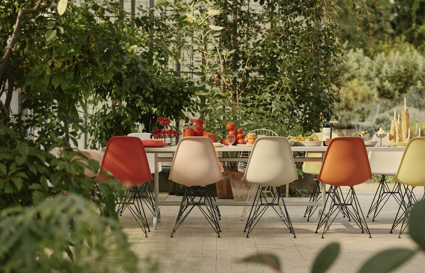
Reds and Pinks for energy
Jewel coloured pinks and warm reds are really popular for a reason, they can lift a room, work well in colour drenching but also against a neutral background colour to add energy.
The Hey Rey Dining Chair feels nostalgic with soft curves and a really distinctive profile. Designed by Bruno Rey in 1971 and a recognisable piece of Swiss design
Bruno Rey's unique and simplistic vision. Based on the original Rey Chair, one of today's most recognisable pieces of Swiss industrial design, it feels both classic and timeless.
Shop the Hay Rey Chair and Bar Stool

The Hay Arbour Sofa is Denmark's first Nordic Swan Ecolabel sofa and feels bright with its red beech frame and pink rewool material.
Shop Hay Arbour sofa

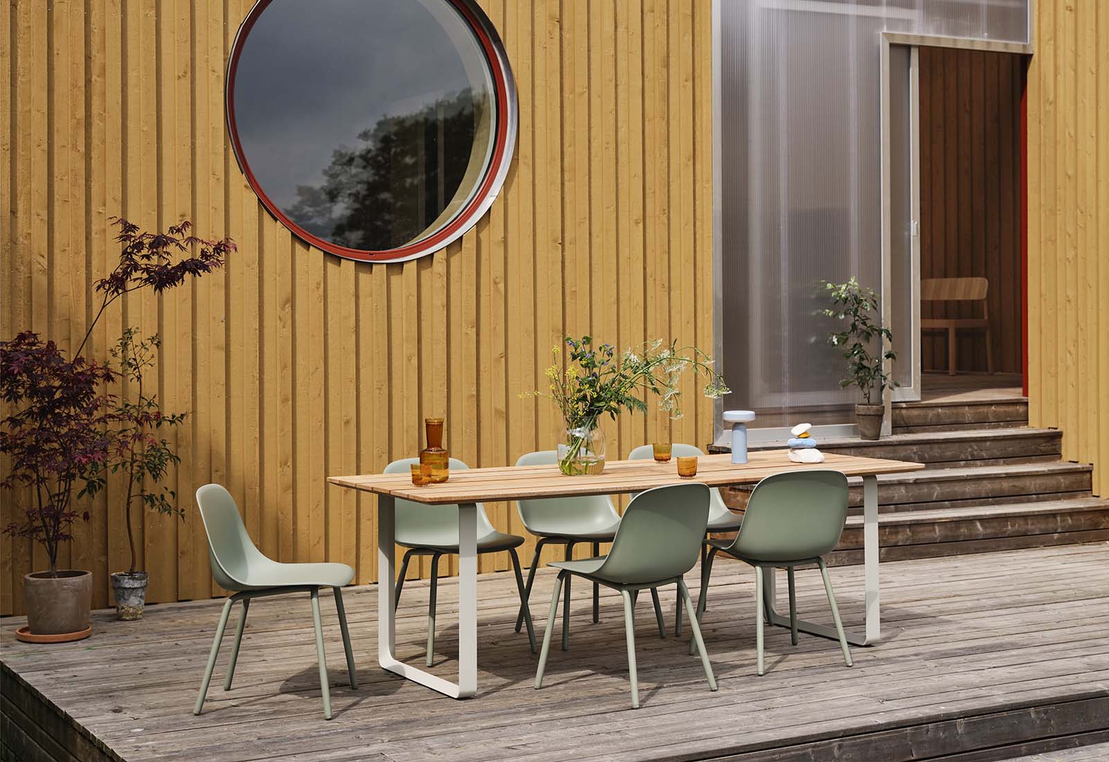
Greens are soothing and nature-inspired
Using different shades of green in one space feels like planting an outdoor space - the different shades and textures combine so well and together you have a recipe to beat anxiety.
USM Haller has recently released their much-loved (a total customer favourite) storage unit in olive green. Its so low-key and modern and feels ultra calming.
Shop USM in olive green

For a brighter feel, the Vitra Colour Frame Mirror in green and pink will brighten any wall you put it on, with the classic colour pairing feeling fresh and playful.
Shop Vitra Colour Mirror Frame in Green and Pink

Oranges and yellows, the colours of sunshine for joy
Finding joy in our homes and being bold with the colours of summer always brings the warm energy we want.
The Kartell Masters Chair
A much coveted design by Philippe Starck in homage to three classic chairs - the Ant Chair by Arne Jacobsen, the Tulip Chair by Eero Saarinen and the VItra DSW by Charles and Ray Eames.
Shop Kartell Masters Chair in yellow

Vitra Mariposa
Barber & Osgerby have designed possibly the comfiest sofa ever for Vitra. Buy it in this yellow shade and bring the sunshine into your home or office space.

For outdoor, the Case Eos collection in rust powder-coated aluminium complements the green of the outdoors, works well with modern black and feels contemporary.
Shop Case Eos collection in Rust

Blues for calm, stillness and serenity
You can get lost in shades of blue for days. They can be peaceful or bright and energetic depending on the shade you choose.
House of Finn Juhl Cabinet
Designed in 1955 originally for Danish furniture maker Bovirke in the colours of Goethe's colour wheel this is an iconic, unusual piece of furniture.